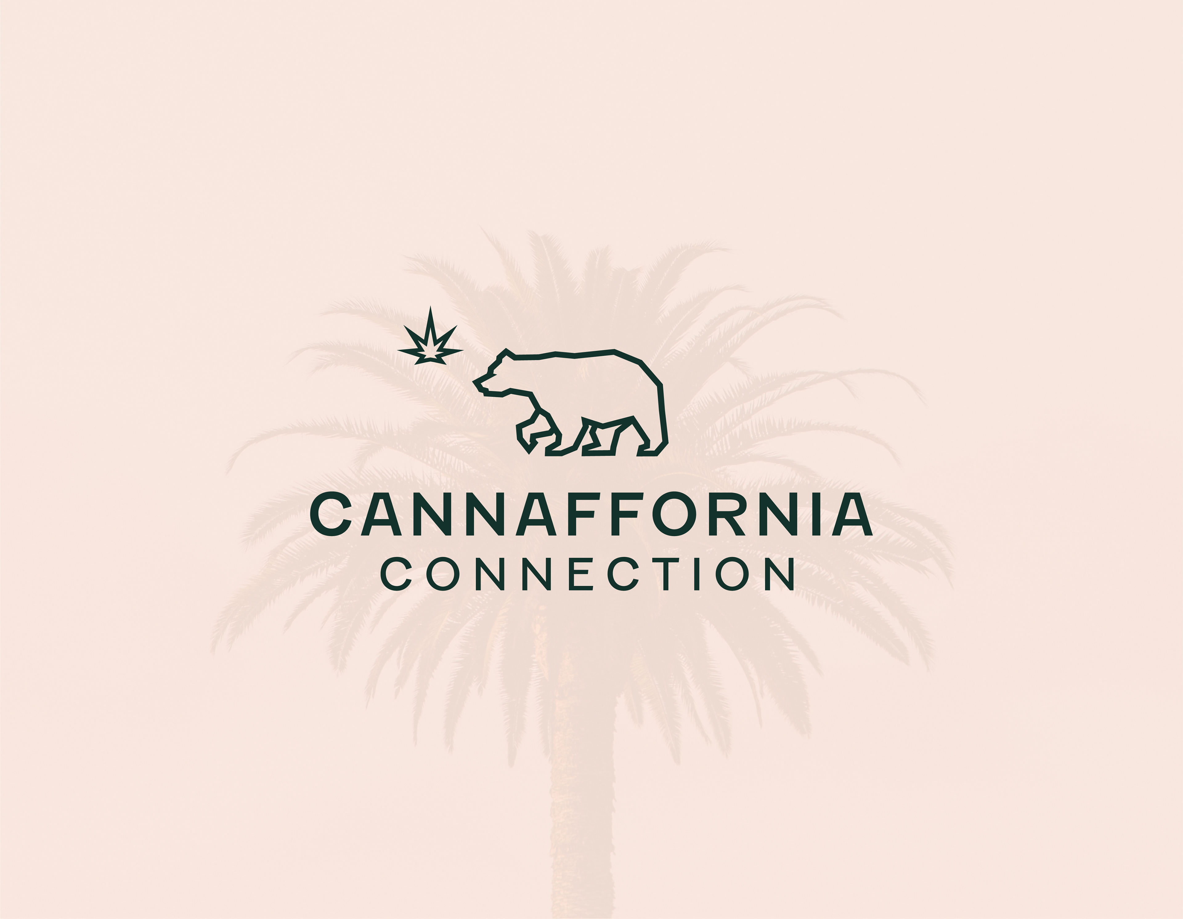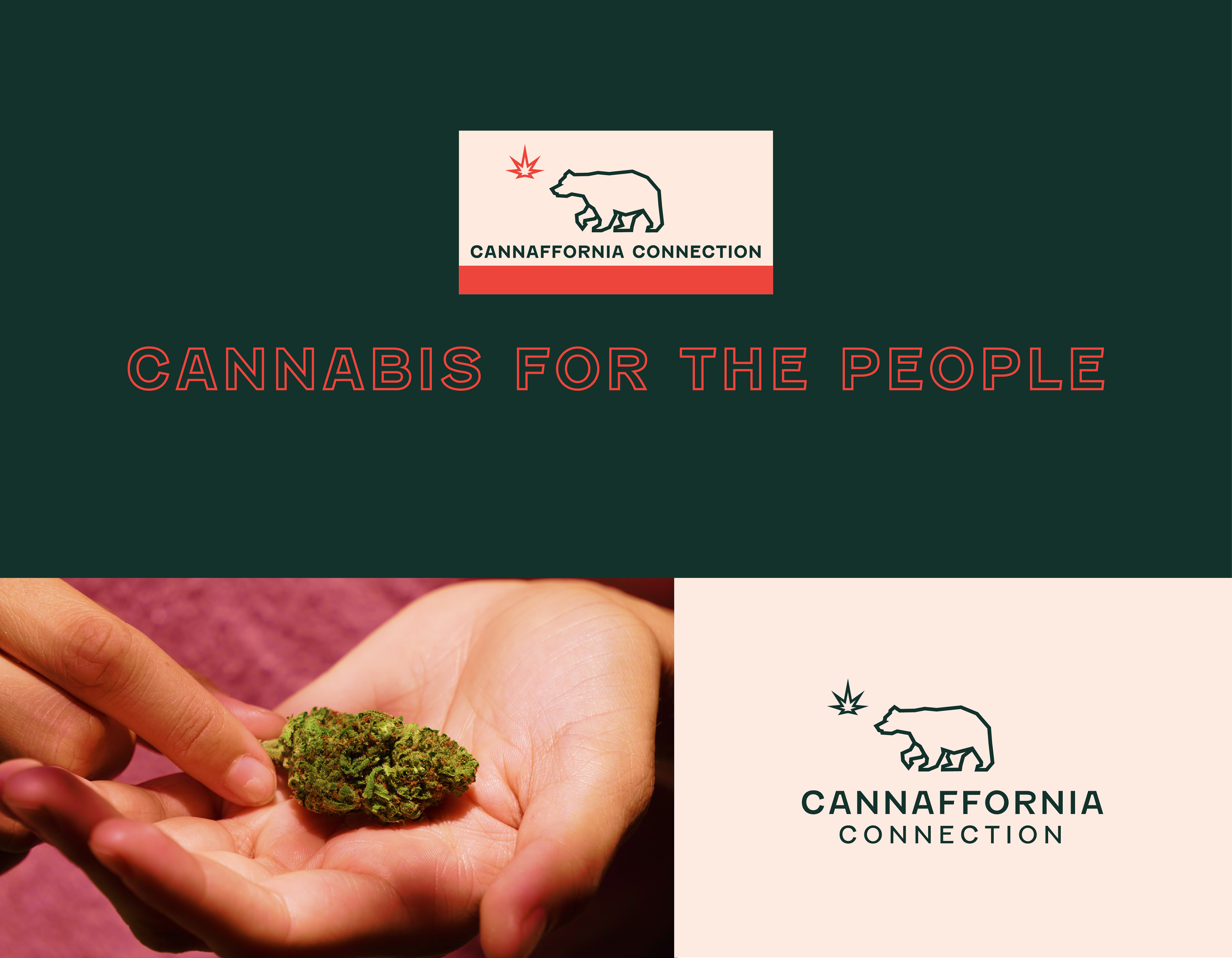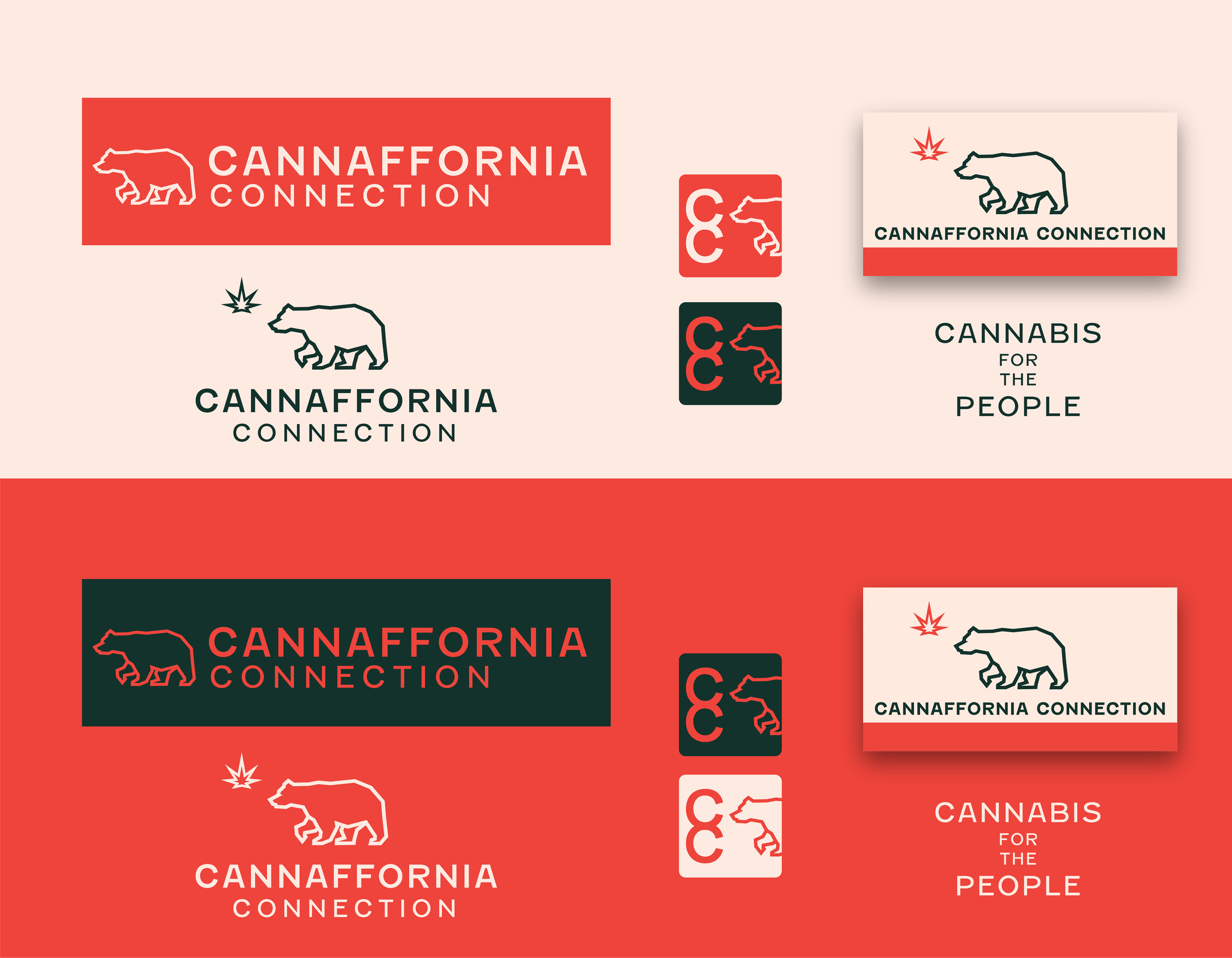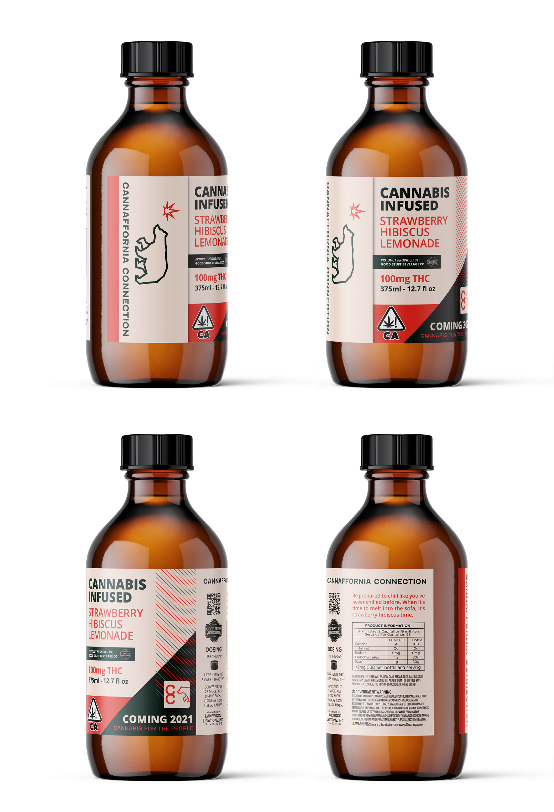
Brief: Client in search of a look that represents affordable quality with an all-inclusive appeal to both budget-minded and high-end consumers.
Solution: The geometric logo mark strikes a perfect balance between professionalism and a clear representation of a cannabis production/retail company. The typography exudes a mature and modern aesthetic, evoking a sense of adventure and innovation and the color palette is both inviting and versatile, drawing inspiration from our brand's deep roots in California. The logo, inspired by the California flag, pays homage to the essence of the state and the fundamental plant on which the business thrives. This design encapsulates the essence of the brand and its core values with a touch of creativity and flair.